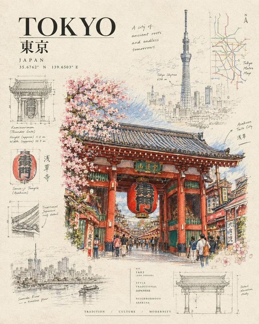
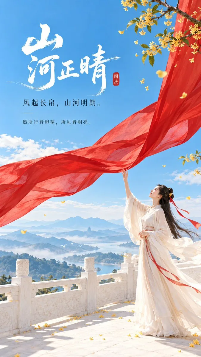
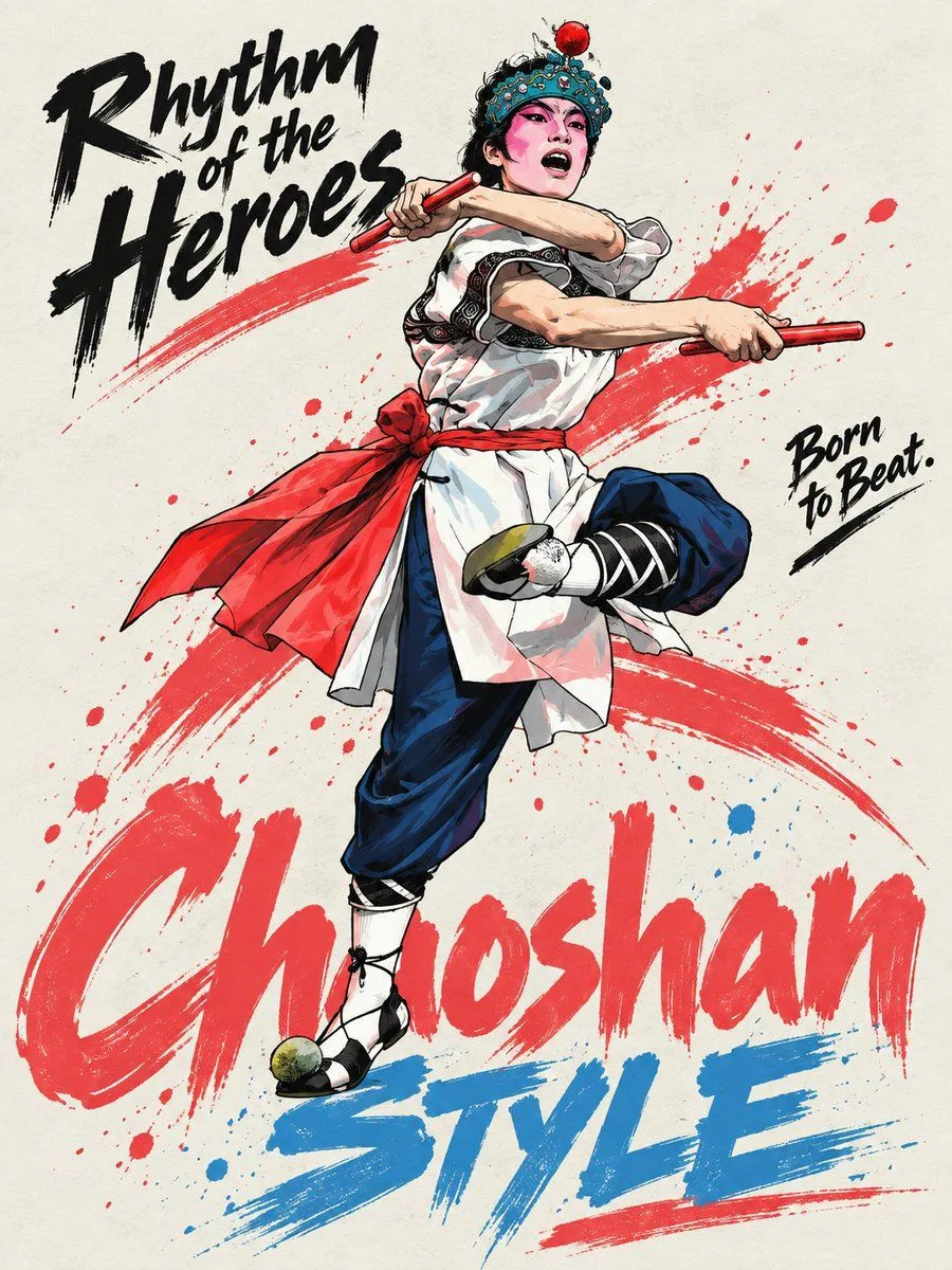
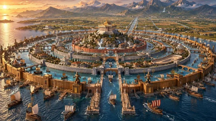
日系旅行杂志荒诞歪头横向构图海报
[Character], preserve the most core identification features of the character, including face shape, hairstyle silhouette, hair color, pupil color, iconic accessories, clothing structure, representative colors, and temperament. Design the character as a Japanese travel magazine Editorial poster with a slight internet Meme vibe. The character is shot in an extreme close-up, with the head tilted significantly to one side by about 70–90°, the face almost horizontal in the frame, and the head and face occupying more than half of the image; the upper body invades the composition horizontally from the right or bottom right, with shoulders, hair, and body extending naturally out of the frame, forming an unconventional 'horizontal intrusion into the frame' posture. The character's eyes are clearly visible and looking directly at the camera, with a natural expression, slightly confused, curious, or indifferent, not doing standard studio poses, and not standing upright. Use slight wide-angle close-up perspective, the face is close to the lens, features have slight perspective magnification but remain natural and accurate; the subject creates a clear directional conflict with the vertical layout direction, creating a visual contrast of 'character posture is wrong, but poster design is very formal'. The background is a clean, ordinary modern space with a slight sense of daily life, which can use light blue tiles, glass, walls, hotels, stations, travel scenes, or minimalist interiors, not cinematic scenes. The overall photography is close to a mobile phone snapshot or an ordinary consumer-grade digital camera snapshot, with natural and bright light, clear and direct, without strong cinematic lighting or exaggerated shallow depth of field. The layout uses Japanese Travel Editorial × Lifestyle Magazine × Contemporary Asian Commercial Poster × Vernacular Meme Design. The overall layout is an asymmetric editorial grid: oversized bold Chinese theme characters are placed on the top left or left side, with vertical Japanese katakana added alongside; the top right uses a large area of white space and thin line arcs / information bubbles to arrange dates, locations, and short descriptions; a small amount of mixed Chinese, Japanese, and English small explanatory text, place names, kana phonetic notation, and travel information are added around the character; a relatively neat commercial information bar is set at the bottom of the image. The font structure emphasizes the scale contrast between oversized Chinese characters and miniature editorial text, using bold sans-serif, narrow-body black fonts, vertical Japanese, and small English auxiliary information. The layout is professional, clean, and restrained, with a clear hierarchy of information, but the character's posture is deliberately absurd. Colors are based on cool white, light gray, and blue-gray, with large areas of white space; deep purple and black serve as visual anchors for the main text, with a small amount of orange thin lines, arcs, or information graphics as auxiliary emphasis colors. Overall effect: A Japanese travel magazine or commercial promotional poster that looks very formal, but the order is broken by a character with a large-angle tilted head and an ultra-close-up horizontal intrusion into the frame. Formal Editorial Design × Absurd Subject × Deadpan Humor × Internet Meme Vibe.
More like this