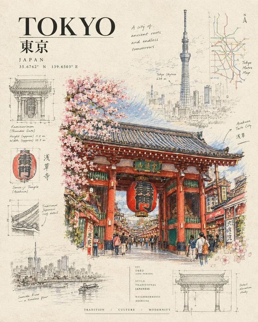
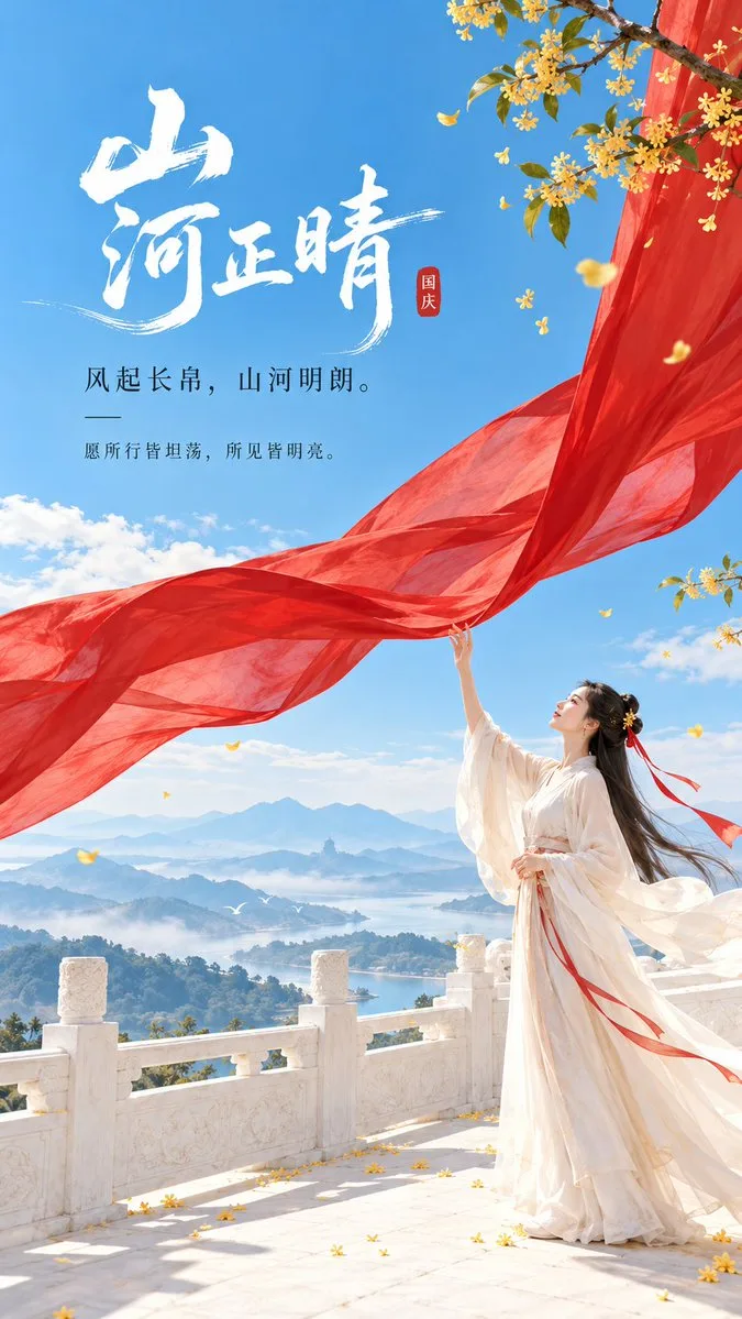
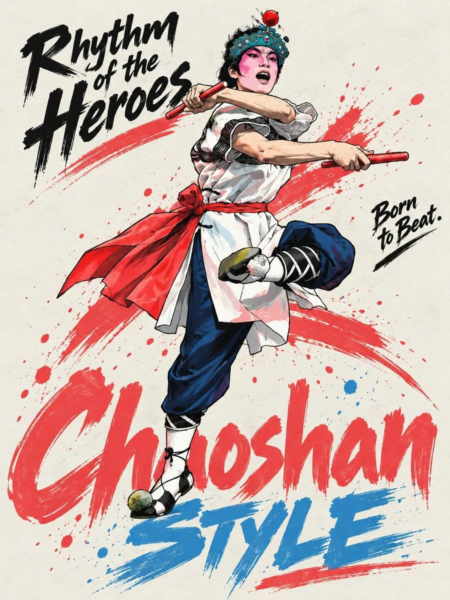
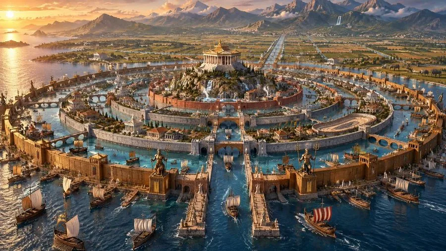
现代东方编辑美学文化展览海报
【Subject / Exhibition Name】{Fill in, e.g., Bamboo Weaving Craft / System of Weights and Measures / Ancient Postal Relays / Granary System} 【Main Title】{Fill in} 【Core Visual Structure】{Fill in, e.g., Circular Weaving / Balanced Horizontal Axis / Segmented Relay Paths / Staggered Granary Grids} 【Main Color Gamut】{Fill in 3–5 colors, e.g., Bamboo Yellow + Warm White + Gray-Green / Vermilion Ochre + Ink Blue + Earth Gold} 【Micro-scenes】{Fill in 1–3 real cultural behaviors, e.g., Bamboo weaving / Calibrating scales / Handover of documents / Grain storage registration} 【Cultural Elements】{Fill in a small number of necessary objects or institutional nodes} 【Exhibition Info】{Date / Location / Type, optional} 【Aspect Ratio】9:16 vertical Design a cultural exhibition poster with modern Oriental editorial aesthetics, using "paper fiber + large color gamut + micro-scenes" as the core visual language. First, refine a structural relationship that best represents the essence of the content based on the [Subject / Exhibition Name], making the [Core Visual Structure] directly become the compositional skeleton of the entire image, rather than painting an ordinary scene first and then overlaying text. For example, one can use the interleaving of paper ribbons to represent weaving, huge horizontal axes and end blocks to represent measurement, continuous segmented color gamuts to represent information transmission, and staggered heavy blocks to represent storage and order. Use the [Main Color Gamut] to establish 2–5 large paper-based color blocks with clear scale differences. The color blocks should have real, rich, yet clean textures of handmade paper, watercolor pulp, or mineral pigments, visible natural long and short fibers, herbal fibers, pulp particles, pigment deposits, slight indentations, large-scale natural color variations, and irregular torn paper edges. The color surfaces should remain intact, matte, and heavy, without being dirty, old, yellow-spotted, randomly mottled, heavily noisy, or having cheap vintage effects. When viewed from a distance, one should first see clear large color gamut relationships and structural actions, remaining clearly recognizable even when reduced to social media feed sizes. The large color gamut is not background decoration but must truly carry the content logic. Based on the theme, let the paper blocks intersperse, bite, enclose, support, segment, stagger, balance, surround, or continuously transmit, allowing the audience to first feel core concepts such as "weaving, measuring, relaying, storing" without reading the text. Avoid making the image into a regular PPT grid, flowchart, or ordinary Chinese-style collage. Embed small-scale [Micro-scenes] between the large color gamuts, with figures and props generally occupying about 3%–6% of the frame. Figures must be performing a real action, such as weaving bamboo, measuring with a ruler, handing over documents, changing horses, measuring grain, or registering granary records, rather than posing for a photo. If the theme itself includes a process, 2–3 continuous small nodes can be set to let the miniature figures bear the narrative function; if the theme is more craft-oriented, a single complete small scene is sufficient. The number of [Cultural Elements] in the scene should be restrained, keeping only the objects, tools, documents, or markings that truly explain the theme, without commercial displays or piling up traditional cultural symbols. A very small amount of cinnabar red, warm orange, old gold, or deep ink can be used as visual nodes, such as seals, strips, lights, rulers, document stamps, etc., but they must have a real relationship with the content, with the total area usually controlled at 1%–3%. Do not randomly add seals, auspicious clouds, flying birds, landscapes, or decorative patterns for the sake of "Oriental feeling." Typography adopts the language of modern cultural institutions, museums, archival exhibitions, or Oriental editorial design. The main title [Main Title] uses slender, upright Chinese Songti, Mingti, or modern fonts with a sense of publication, maintaining small to medium font sizes so the text does not overpower the large color gamut. Small font sizes are used for auxiliary English, dates, locations, and exhibition descriptions to form a clear hierarchy. Text is only responsible for information and does not bear the main visual impact; all content must have real meaning, not using meaningless placeholders like RANDOM, DESIGN, ART, STUDIO, etc. The overall reading order should be: large paper color gamut and structural relationships → thematic concepts and spatial logic → miniature figure scenes and cultural behaviors → title and exhibition information. The final image should achieve strong memory points for large shapes, color gamuts, and compositions when viewed from afar, while paper fibers, figure actions, institutional nodes, and object details are only discovered upon close inspection, possessing both material texture and a sense of narrative and methodology. Avoid: book cover vibes, ordinary traditional Chinese-style illustrations, realistic photographic backgrounds, screen-full of ancient architecture, large ancient-costume figures, huge titles, PPT-style layouts, modern infographic arrows, stacking of elements, meaningless English, commercial advertising feel, dirty/old paper, 3D CGI, glass materials, plastic feel, neon colors, logos, watermarks, numbering, and starburst decorations.
More like this